Introduction
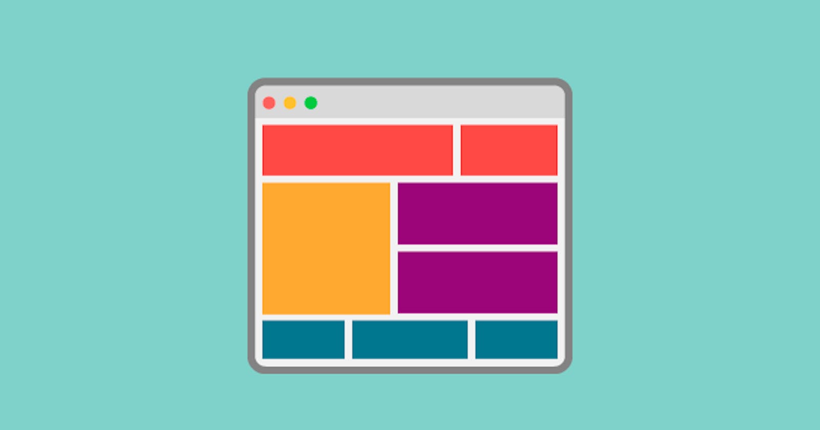
In web development, creating a flexible and responsive layouts is very crucial to providing an optimal user experience across various devices and screen sizes. Fortunately, CSS Flexbox provides a powerful solution to this challenge. In this beginner's guide, we will explore Flexbox and its properties in detail, To create dynamic and visually appealing layouts with ease.
What is Flexbox?
So before starting with the flexbox we should know what is flex box and why we need flexbox. Flexbox, short for Flexible Box Layout, is a layout model in CSS that allows you to design complex and responsive layouts with minimal effort. It enables you to align and distribute space among items within a container, making it ideal for building navigation menus, grids, card layouts.
Flexbox is great for arranging things neatly in one direction, either horizontally or vertically. It's like lining up items in a row or a column effortlessly. This makes it super flexible and easy to work with, giving you more control over how things are laid out on a webpage.
Getting Started:
To begin with Flexbox, you first need to understand the concept of flex containers and flex items. A flex container is any element set to display: flex;, while its immediate children become flex items. Let's see some of the essential properties of Flexbox:
Display: flex;
This property transforms an element into a flex container, allowing you to utilize Flexbox features. Once applied, the immediate children of this container become flex items, which you can then align and arrange according to your layout needs.
.container {
  display: flex;
}
Flex-direction:
This property sets the direction of the main axis along which flex items are laid out within the flex container. There are four possible values:
row: Items are arranged horizontally from left to right.row-reverse: Items are arranged horizontally from right to left.column: Items are arranged vertically from top to bottom.column-reverse: Items are arranged vertically from bottom to top.
Flex-wrap:
This property determines whether flex items should wrap onto multiple lines when they reach the end of the flex container, or if they should remain on a single line. It has three options:
nowrap: Items remain on a single line (the default behavior).wrap: Items wrap onto multiple lines as needed to fit the container.wrap-reverse: Items wrap onto multiple lines in reverse order.
Justify-content:
This property aligns flex items along the main axis of the flex container. It controls the distribution of space between and around flex items. The available options are:
flex-start: Items are packed toward the start of the main axis.flex-end: Items are packed toward the end of the main axis.center: Items are centered along the main axis.space-between: Items are evenly distributed along the main axis, with the first item at the start and the last item at the end.space-around: Items are evenly distributed along the main axis, with equal space around them.
Align-items:
This property aligns flex items along the cross axis of the flex container. It specifies how flex items should be aligned within the flex container when they do not fill the entire cross-axis dimension. Options include:
stretch: Items are stretched to fill the cross-axis dimension.flex-start: Items are aligned at the start of the cross axis.flex-end: Items are aligned at the end of the cross axis.center: Items are centered along the cross axis.baseline: Items are aligned based on their baselines.
Align-content:
This property aligns lines of flex items along the cross axis when there is extra space in the flex container. It is similar to align-items but works on the lines of flex items rather than individual items. The options are:
stretch: Lines are stretched to fill the remaining space.flex-start: Lines are packed toward the start of the cross axis.flex-end: Lines are packed toward the end of the cross axis.center: Lines are centered along the cross axis.space-between: Lines are evenly distributed along the cross axis, with the first line at the start and the last line at the end.space-around: Lines are evenly distributed along the cross axis, with equal space around them.
flex-grow, flex-shrink, flex-basis:
These properties collectively control how flex items grow, shrink, and their initial size.
flex-grow: Specifies the ability for a flex item to grow if necessary.flex-shrink: Specifies the ability for a flex item to shrink if necessary.flex-basis: Specifies the initial size of a flex item before any free space is distributed.
Creating a navbar using the flexbox:
<!DOCTYPE html>
<html lang="en">
<head>
<meta charset="UTF-8">
<meta name="viewport" content="width=device-width, initial-scale=1.0">
<title>Flexbox Navbar</title>
<style>
  body {
    margin: 0;
    font-family: Arial, sans-serif;
  }

  .navbar {
    display: flex;
    justify-content: space-between;
    align-items: center;
    background-color: #333;
    color: #fff;
    padding: 10px 20px;
  }

  .navbar-brand {
    font-size: 1.5rem;
    text-decoration: none;
    color: #fff;
  }

  .navbar-nav {
    display: flex;
    list-style-type: none;
    margin: 0;
    padding: 0;
  }

  .nav-item {
    margin-right: 20px;
  }

  .nav-link {
    text-decoration: none;
    color: #fff;
    font-weight: bold;
  }

  .nav-link:hover {
    color: #ffd700; /* Change color on hover */
  }
</style>
</head>
<body>

<nav class="navbar">
  <a href="#" class="navbar-brand">Flexbox Navbar</a>
  <ul class="navbar-nav">
    <li class="nav-item"><a href="#" class="nav-link">Home</a></li>
    <li class="nav-item"><a href="#" class="nav-link">About</a></li>
    <li class="nav-item"><a href="#" class="nav-link">Services</a></li>
    <li class="nav-item"><a href="#" class="nav-link">Contact</a></li>
  </ul>
</nav>

</body>
</html>
Thanks for reading!
I hope you found this article useful. If you have any questions or suggestions, please leave comments below. Your feedback will help me improve the content for our mutual benefit.
Don’t forget to subscribe and follow for more insightful articles on web development, design, and technology!
Happy coding !
